Improving the user experience to better help Service Area Businesses
How I redesigned the user experience for service area businesses and achieved a 3x conversion improvement and eliminated daily support complaints
Project Timeline
8 weeks
38 daily SABS
3x Uplift
Team Impact
0 CS Enquiries
Role
Solo Designer


Problem
Service Area Businesses faced significant barriers when trying to add their locations to the BrightLocal platform. This came to our attention when we carried out user interviews as well as through daily customer support enquiries.
The key pain points identified were:
Privacy Concerns
SABs didn't want residential addresses visible on public listingsConfusing UX
Throughout the platform, the user experience was confusing for SABs, most markedly when adding a location but also throughout the toolsDaily Support Issues
This was leading to frequent complaints which was costing the business time and resources
SABs struggled to add a location, which in turn meant they didn't unlock the value of the BrightLocal platform.
Design Process
As we had identified the key pain points through research and close communication with the customer support team, I choose a two step design process.
Measurement & Tracking Setup
Before this project, we had no tracking infrastructure in place to measure the success of our location wizard and without baseline metrics, we couldn't quantify the impact of our improvements or make data-driven decisions.
Therefore, we worked together cross-functionally to set this tracking up pre-release.
Cross-Functional Collaboration:
Data & Insights Analyst Partnership
Collaborated to define key metrics, establish baseline measurements, and create comprehensive tracking specifications for user behaviour analysisFront-End Engineer Collaboration
Worked together to implement tracking events, ensure data quality, and validate that all user interactions were properly capturedGoogle Analytics Setup
Configured comprehensive GA tracking to monitor user journeys, conversion funnels, and business-type specific behaviours post-launch
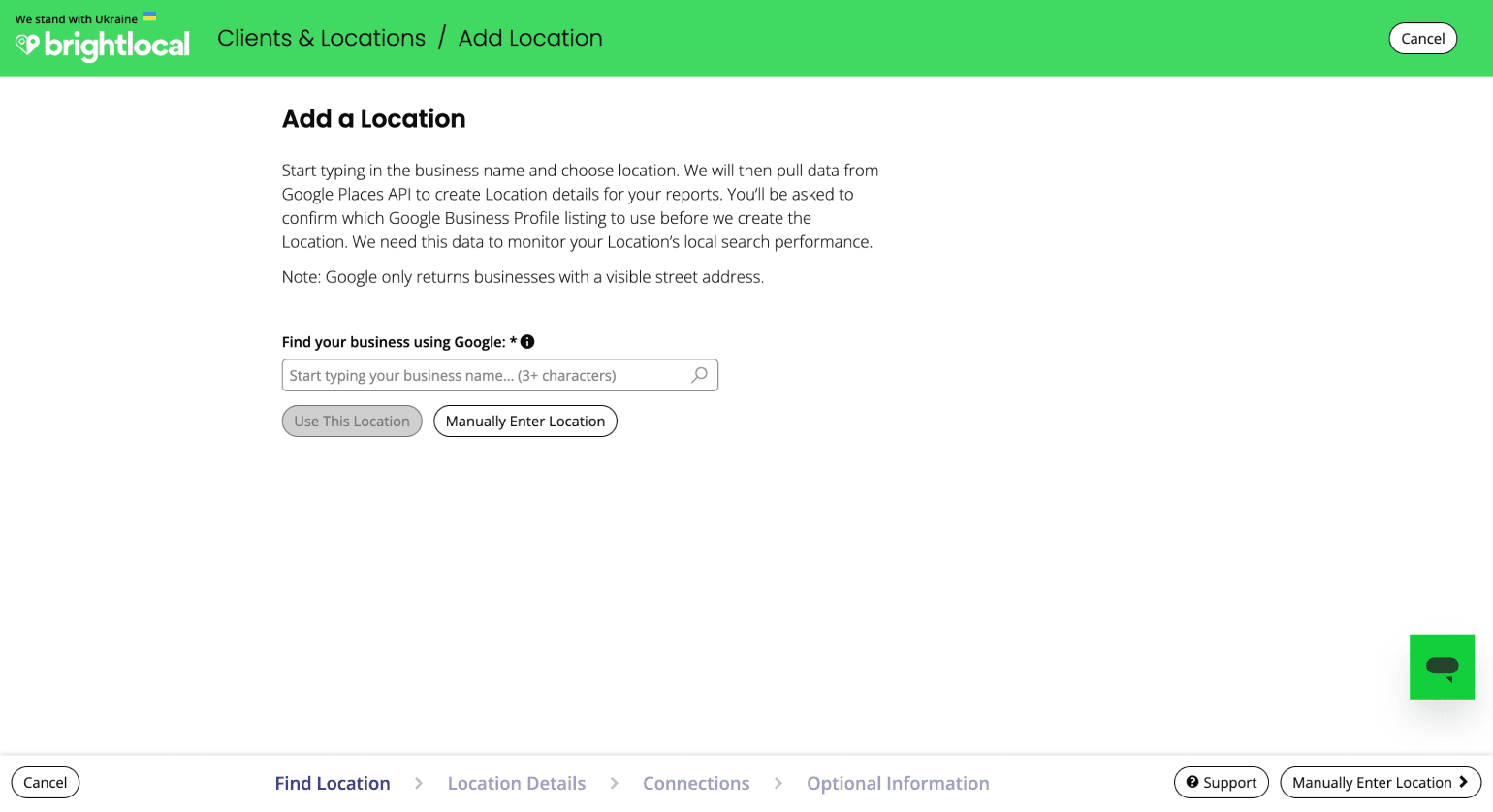
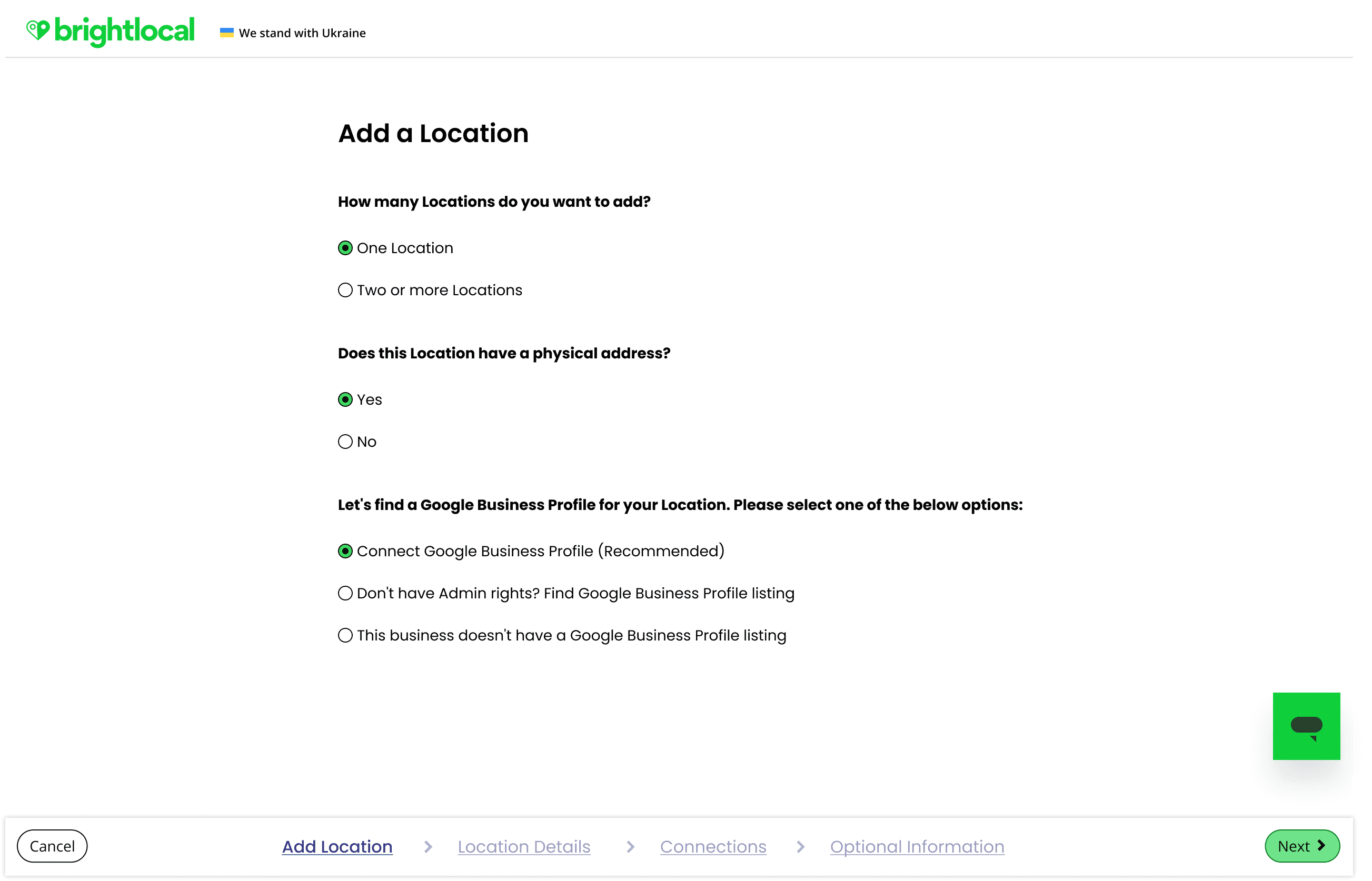
Solution Overview
Below outlines the solution for the newly improved user journeys
Golden Path Design
Design the golden for every user group to add a location in a way that is intuitive, and frictionless and helps them get value out of the platform as fast as possible
Make Every Word Count
I applied our design principle 'Make Every Word Count' by cutting down the lengthy copy currently in the Add Location Wizard
Keep It Consistent
Ensure that any changes were consistent with other areas of the platform
High-fidelity Prototypes
As the next stage, I used Figma to draw up the triaged user flow and carried out some user testing with our customer support team via a Figma prototype and three tasks to complete.
Impact Metrics
The graph below shows the impact the newly improved designs had on conversion, with an instant improvement.

3x
Conversion Rate
Improvement
38
New SABs
Added Daily
0
Customer Support
Complaints
100%
Overnight
Success
Key Takeaways
What learnings did I take from the project?
User-centric
Understanding specific user needs leads to targeted, effective solutions and tangible business outcomes
Measurable Impact
Good UX design can directly translate to improved business metrics however without tracking it's very difficult to measure success