gingerbread baking kit with the pre-measured ingredients needed to bake

Helping Sofar Sound to improve their search experience for new users

Sofar Sounds is a music events company that organises intimate performances with smaller artists, hosted in over 400 cities worldwide. Whilst attending the Memorisely Bootcamp I explored a redesign of Sofar Sounds web and how the currently limited search experience could be improved.

Sofar Sounds is a music events company that organises intimate performances with smaller artists, hosted in over 400 cities worldwide. Whilst attending the Memorisely Bootcamp I explored a redesign of Sofar Sounds web and how the currently limited search experience could be improved.

Helping Sofar Sound to improve their search experience for new users

gingerbread baking kit with the pre-measured ingredients needed to bake

At present, searching for available intimate concerts on Sofar Sounds is very limited which was a friction point I explored as a case study whilst working solo during the Memorisely Bootcamp.

Role

User Research

Product Strategy

UI Design

Interaction Design

Usability Testing

Tools

Figjam

Figma

Dovetail

Maze

Notion

Timeline

5 weeks

The Problem

Currently, the web search experience of the gig booking platform Sofar Sounds has a very limited search, limited to a search bar with only a single dropdown list of locations and a limited number of filters to apply to the search results. A key business constraint to consider throughout is that performing artists are never known until the attendees arrive at the concert.

Currently, the web search experience of the gig booking platform Sofar Sounds has a very limited search, limited to a search bar with only a single dropdown list of locations and a limited number of filters to apply to the search results. A key business constraint to consider throughout is that performing artists are never known until the attendees arrive at the concert.

Currently, the web search experience of the gig booking platform Sofar Sounds has a very limited search, limited to a search bar with only a single dropdown list of locations and a limited number of filters to apply to the search results. A key business constraint to consider throughout is that performing artists are never known until the attendees arrive at the concert.

The Solution

By improving the information architecture of the Sofar Sounds website as well as some of the design elements, Sofar Sounds could make it easier for music lovers to get inspired and build enough confidence to book concerts. In turn, these changes could lead to an increase in the booking conversion rate.

By improving the information architecture of the Sofar Sounds website as well as some of the design elements, Sofar Sounds could make it easier for music lovers to get inspired and build enough confidence to book concerts. In turn, these changes could lead to an increase in the booking conversion rate.

By improving the information architecture of the Sofar Sounds website as well as some of the design elements, Sofar Sounds could make it easier for music lovers to get inspired and build enough confidence to book concerts. In turn, these changes could lead to an increase in the booking conversion rate.

Usability Review

To begin, I carried out a usability review to understand the ease of use of the search and booking experience. Within Figjam, I highlighted the pain points (on red stickies) and wow moments (on green stickies).

Discovery and Booking on Sofar Sounds Web

Discovery and Booking on Sofar Sounds Web

Discovery and Booking on Sofar Sounds Web

Business & User frustrations

The current web search experience does go far enough in building trust and confidence to find a gig and understand what you can expect from your night

The current web search experience does go far enough in building trust and confidence to find a gig and understand what you can expect from your night

The current web search experience does go far enough in building trust and confidence to find a gig and understand what you can expect from your night

Primary Frustration

Primary Frustration

Primary Frustration

The overall Sofar Sounds search experience is very limited. You are only able to filter by city and upcoming days, week or month.

Secondary Frustration

Secondary Frustration

Secondary Frustration

Whilst there is the constraint of not knowing who live artists are, there isn't enough information or excitement built into the user journey to help delight the user and build enough confidence for them to buy tickets.

Competitor Benchmarking

In order to gain inspiration and see existing UX/UI standards, we carried out competitor benchmarking of direct and indirect competitors DICE and Canopy and Stars (see below). DICE is a platform to book concerts whilst Canopy and Stars is a platform to discover and book unique, creative spaces outdoors.

In order to gain inspiration and see existing UX/UI standards, we carried out competitor benchmarking of direct and indirect competitors DICE and Canopy and Stars (see below). DICE is a platform to book concerts whilst Canopy and Stars is a platform to discover and book unique, creative spaces outdoors.


In order to gain inspiration and see existing UX/UI standards, we carried out competitor benchmarking of direct and indirect competitors DICE and Canopy and Stars (see below). DICE is a platform to book concerts whilst Canopy and Stars is a platform to discover and book unique, creative spaces outdoors.

DICE Discovery and Booking on Web

DICE Discovery and Booking on Web

DICE Discovery and Booking on Web

Canopy & Stars Discovery and Booking on Web

Canopy & Stars Discovery and Booking on Web

Canopy & Stars Discovery and Booking on Web

User Research Interviews & Affinity Mapping

In addition to the usability reviews and competitor benchmarking, I carried out 4 user research interviews with people who had attended gigs putting together an interview script.


I used Dovetail to upload the transcripts, highlight the text to create tags, which in turn could be turned into an affinity map to help synthesis the data. The process was very interesting and insightful.

Highlighted Interview Transcripts from Dovetail

Affinity Map from Dovetail

Highlighted Interview
Transcripts from Dovetail

Affinity Map from Dovetail

Problem Space

Having conducted our usability review and competitor benchmarking, it became clear that the search and overall site experience could be improved.

Having conducted our usability review and competitor benchmarking, it became clear that the search and overall site experience could be improved.

Having conducted our usability review and competitor benchmarking, it became clear that the search and overall site experience could be improved.

We therefore begun a process of mapping out the information architecture as well as as brainstorming, about how to improve the overall experience with a focus on the problem space front and center of our minds.

We therefore begun an ideation process of how we might help returning users connect with friends and check their latest reviews, buildi

We therefore begun a process of mapping out the information architecture as well as as brainstorming, about how to improve the overall experience with a focus on the problem space front and center of our minds.

Information Architecture

With the insights gathered, I then mapped out the information architecture of the product to gain a better understanding of how we could improve the hierarchy of information on a page, section, and component level.

With the insights gathered, I then mapped out the information architecture of the product to gain a better understanding of how we could improve the hierarchy of information on a page, section, and component level.

With the insights gathered, I then mapped out the information architecture of the product to gain a better understanding of how we could improve the hierarchy of information on a page, section, and component level.

Ideation

I created a mindmap of what we could add or improve as well as a series of crazy 8's.

As pa

I created a mindmap of what we could add or improve as well as a series of crazy 8's.

What can we add

A search experience that is easy to use and delights the user

A search experience that is easy to use and delights the user

A search experience that is easy to use and delights the user

What can we improve

Helps users find the gig and venue they want quicker by applying filters

User Flows

Next we turned our attention to user flows and used Figjam to map out the current user flow as well as possible improved user flows.

Next we turned our attention to user flows and used Figjam to map out the current user flow as well as possible improved user flows.

Rapid Prototyping - Wireframing

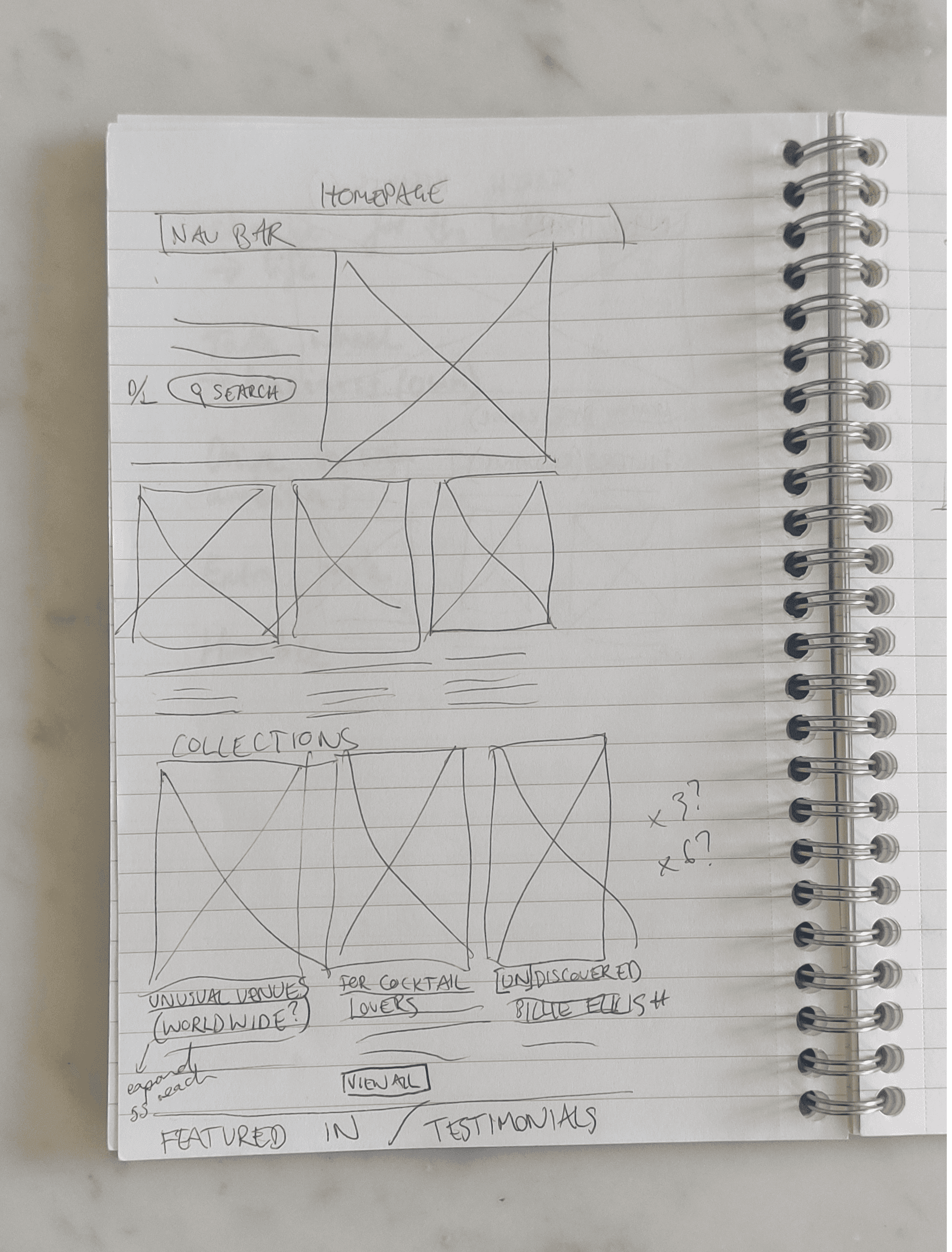
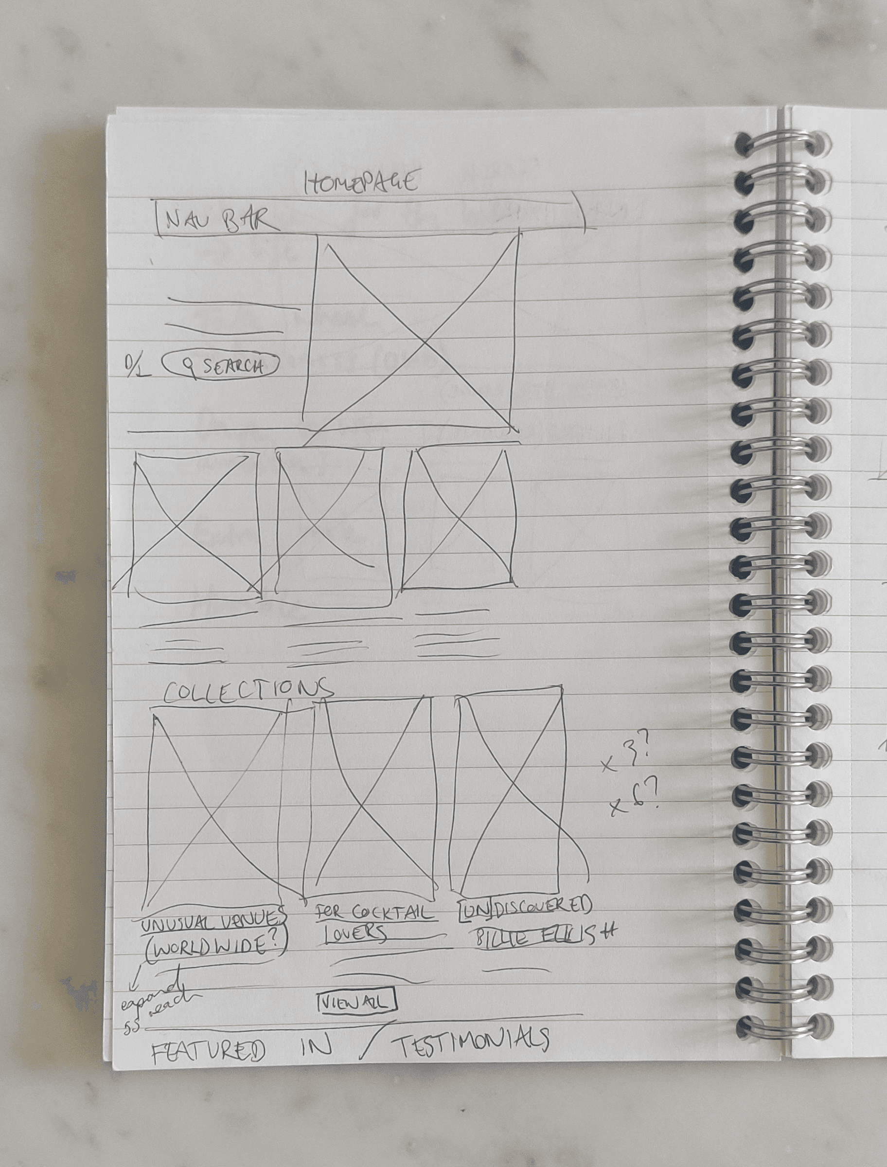
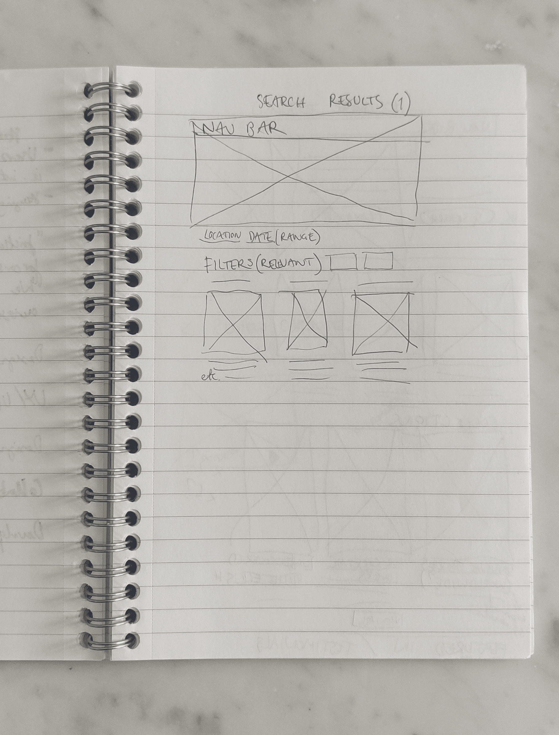
Having carried out the mindmapping, I went about wireframing the potential imrpovements and things we could add in Figjam as well as sketching in a notebook whilst on the London tube!

Styles & Components

Ahead of building the prototype, I started by creating the colour styles and text styles within Figma, from action primary and secondary colours to text for headings, body and buttons. We made sure to reference Sofar Sounds' published brand guidelines. I then started to build components from button sets and search bars, to cards and nav bars.

High-fidelity prototype

I then built a high fidelity prototype which you can view in a Loom video by clicking the button below or the desktop image opposite. It was really important to make search part of the whole experience so as well as adding a search bar in the nav bar, I added a larger one on the homepage. Users can search by location, date and number of attendees. I also added collections to make discovery more enjoyable and easy and filters to help further define the search results.